Flex Rating Component
 For our new Fill Colors site, Nahuel developed a rating component to allow people to rate the Flex skins in the gallery. In this blog, we'd like to share this straightforward and easy-to-use component.
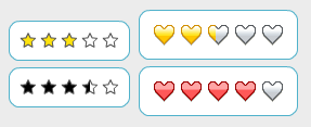
To use the rating component, you simply use a single tag <controls:Rating/> and you can specify optional attributes. We have examples of different attributes being used along with the source.
For our new Fill Colors site, Nahuel developed a rating component to allow people to rate the Flex skins in the gallery. In this blog, we'd like to share this straightforward and easy-to-use component.
To use the rating component, you simply use a single tag <controls:Rating/> and you can specify optional attributes. We have examples of different attributes being used along with the source.
In one of the more interesting examples, Example 5, we want the rating the user selects to be displayed both in the rating component and as a number. So we add the following attributes and text that will display the selected value:
For more information, we also have the API documentation.
View example (View source enabled on Right Click)
Download the source
View API documentation