Mobile ItemRenderer in ActionScript (Part 4)
This is part 4 of my series on item renderers. This time we have a more real example that includes two states (selected and up) plus and avatar image and a bunch of text fields.
What I choose as the example is a TweetRenderer that shows the picture of the user, the user name and the content of the tweet.
For reference these are the previous posts: part 1, part 2, and part 3.
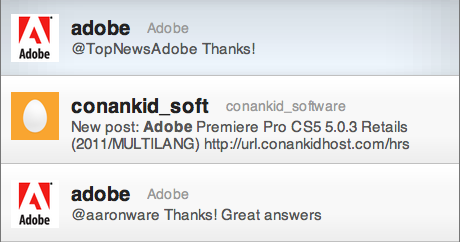
To simplify the code, I call the twitter service with a hardcoded value "Adobe" to receive all the tweets that include that word. As you may notice, I'm not following the best practices with services and added them in the Application file.
Styles
Now that we have more elements, our styles are growing a little bit.
We do not longer have the background-color property, because we are using images to paint the background instead. We have 2 images, one for the selected state and another for the rest (in this case we have only one, the up state). We use the pseudo selectors to target the different states but in both cases the name of the property is "background".
Other thing that we have now is individual style classes for the different text fields of the renderer. We have one for the name, one for the username and another for the content.
renderers|TweetRenderer
{
	padding-top: 15;
	padding-left: 10;
	padding-right: 10;
	padding-bottom: 15;
	horizontal-gap: 10;
	vertical-gap: 10;

	name-style: nameRendererStyle;
	user-style: userRendererStyle;
	content-style: contentRendererStyle;
	separator: Embed(source='/styles/images/separator.png' );

	background: Embed(source='/styles/images/background_up.png',
		scaleGridLeft=10, scaleGridTop=20, scaleGridRight=11, scaleGridBottom=21 );
}

renderers|TweetRenderer:selected
{
	background: Embed(source='/styles/images/background_down.png',
		scaleGridLeft=50, scaleGridTop=20, scaleGridRight=51, scaleGridBottom=21 );
}
.userRendererStyle
{
	font-size: 20;
	color: #222222;
	font-family: _sans;
	font-weight: bold;
}
.nameRendererStyle
{
	font-size: 14;
	color: #999999;
	font-family: _sans;
}
.contentRendererStyle
{
	font-size: 15;
	color: #555555;
	font-family: _sans;
}
Renderer
Because we want change the background when the user clicks in the item we need to implement the interface IItemRenderer, that allow the List to notify the renderers every time the selection changes. The help us with that task we create another class, the BaseRenderer that takes cares of the implementation of that interface and the TweetRenderer extends from it.
package renderers
{
	import core.StyleClient;
	import spark.components.IItemRenderer;
	public class BaseRenderer extends StyleClient implements IItemRenderer
	{
		//  Public Setters and Getters

		protected var _data:Object;
		public function set data( value:Object ):void
		{
			if( _data == value )
				return;

			_data = value;
			// if the elements has been created we set the values
			if( creationComplete )
				setValues();
		}
		public function get data( ):Object
		{
			return _data;
		}
		// selected-------------------------------------------------------------
		protected var _selected:Boolean = false;
		public function get selected():Boolean
		{
			return _selected;
		}
		public function set selected(value:Boolean):void
		{
			if (value != _selected)
			{
				_selected = value;
				updateSkin();
			}
		}
		// dragging------------------------------------------------------------
		/** Property not used but it is required by the interface IItemRenderer  */
		protected var _dragging:Boolean;
		public function set dragging( value:Boolean ):void
		{
			_dragging = value;
		}
		public function get dragging():Boolean
		{
			return _dragging;
		}
		// showsCaret-------------------------------------------------------------
		/** Property not used but it is required by the interface IItemRenderer  */
		protected var _showsCaret:Boolean;
		public function set showsCaret( value:Boolean ):void
		{
			_showsCaret = value;
		}
		public function get showsCaret():Boolean
		{
			return _showsCaret;
		}
		// itemIndex--------------------------------------------------------------
		protected var _itemIndex:int;
		public function set itemIndex( value:int ):void
		{
			_itemIndex = value;
		}
		public function get itemIndex():int
		{
			return _itemIndex;
		}
		// itemIndex--------------------------------------------------------------
		protected var _label:String;
		public function get label():String
		{
			return _label;
		}
		public function set label(value:String):void
		{
			_label = value;
		}
		// --------------------------------------------------------------
		protected function updateSkin():void
		{
			// To be implemented in children
		}
		protected function setValues():void
		{
			// To be implemented in children
		}
	}
}
I added 2 methods to this base class: setValues which is called every time that the data changes and updateSkin which is called every time that the selection changes.
In the method updateSkin that is implemented in the TweetRenderer we change the state of the skin. Changing the state gives us new values for our call to the getStyle method. For example, when we change to the "selected" state and we call getStyle( "background" ) we get the image that is defined inside the pseudo selector TweetRenderer:selected. When we are in the "up" state, we get the default value for the background property. All this CSS functionally is provided by extending StyleClient.
You can see that in the following code
package renderers
{
	import flash.display.DisplayObject;
	import flash.text.TextField;
	import spark.primitives.BitmapImage;
	import spark.primitives.Graphic;
	import utils.TextUtil;
	public class TweetRenderer extends BaseRenderer
	{
		//  Protected properties
		protected var userField:TextField;
		protected var nameField:TextField;
		protected var contentField:TextField;
		protected var avatar:BitmapImage;
		protected var avatarHolder:Graphic;
		protected var background:DisplayObject;
		protected var backgroundClass:Class;
		protected var separator:DisplayObject;
		protected var paddingLeft:int;
		protected var paddingRight:int;
		protected var paddingBottom:int;
		protected var paddingTop:int;
		protected var horizontalGap:int;
		protected var verticalGap:int;

		//  Contructor
		public function TweetRenderer()
		{
			percentWidth = 100;
		}

		//  Override Protected Methods
		override protected function createChildren():void
		{
			readStyles();
			setBackground();
			var separatorAsset:Class = getStyle( "separator" );
			if( separatorAsset )
			{
				separator = new separatorAsset();
				addChild( separator );
			}
			userField  = TextUtil.createSimpleTextField( getStyle( "userStyle" ) );
			addChild( userField );
			nameField  = TextUtil.createSimpleTextField( getStyle( "nameStyle" ) )
			addChild( nameField );
			contentField  = TextUtil.createSimpleTextField( getStyle( "contentStyle" ) , false, "none" );
			contentField.wordWrap = true;
			contentField.multiline = true;
			addChild( contentField );
			avatarHolder = new Graphic();
			avatar = new BitmapImage();
			avatar.fillMode = "clip";
			avatarHolder.width = 48;
			avatarHolder.height = 48;
			avatarHolder.addElement( avatar );
			addChild( avatarHolder );
			// if the data is not null, set the text
			if( data )
				setValues();
		}

		protected function setBackground():void
		{
			var backgroundAsset:Class = getStyle( "background" );
			if( backgroundAsset && backgroundClass != backgroundAsset )
			{
				if( background && contains( background ) )
					removeChild( background );

				backgroundClass = backgroundAsset;
				background = new backgroundAsset();
				addChildAt( background, 0 );
				if( layoutHeight && layoutWidth )
				{
					background.width = layoutWidth;
					background.height = layoutHeight;
				}
			}
		}

		override protected function updateDisplayList( unscaledWidth:Number, unscaledHeight:Number ):void
		{
			avatarHolder.x = paddingLeft;
			avatarHolder.y = paddingTop;
			avatarHolder.setLayoutBoundsSize( avatarHolder.getPreferredBoundsWidth(), avatarHolder.getPreferredBoundsHeight() );
			userField.x = avatarHolder.x + avatarHolder.width + horizontalGap;
			userField.y = paddingTop;
			nameField.x = userField.x + userField.textWidth + horizontalGap;
			nameField.y = paddingTop + ( userField.textHeight - nameField.textHeight ) / 2;
			contentField.x = avatarHolder.x + avatarHolder.width + horizontalGap;
			contentField.y = paddingTop + userField.textHeight + verticalGap;
			contentField.width = unscaledWidth - paddingLeft - paddingRight - avatarHolder.getLayoutBoundsWidth() - horizontalGap;
			layoutHeight = Math.max( contentField.y + paddingBottom + contentField.textHeight, avatarHolder.height + paddingBottom + paddingTop );
			background.width = unscaledWidth;
			background.height = layoutHeight;
			separator.width = unscaledWidth;
			separator.y = layoutHeight - separator.height;
		}

		override public function getLayoutBoundsHeight(postLayoutTransform:Boolean=true):Number
		{
			return layoutHeight;
		}
		override protected function setValues():void
		{
			var arr:Array = String( data.author.name ).split("(");
			var user:String = String( data.author.name )
			userField.text = arr[0];
			nameField.text =  String( arr[ 1 ] ).replace( ")", "" );
			contentField.htmlText = data.content.value;
			if( data.link.length > 1)
				avatar.source = data.link[ 1 ].href;
		}

		override protected function updateSkin():void
		{
			currentCSSState = ( selected ) ? "selected" : "up";
			setBackground();
		}

		protected function readStyles():void
		{
			paddingTop = getStyle( "paddingTop" );
			paddingLeft = getStyle( "paddingLeft" );
			paddingRight = getStyle( "paddingRight" );
			paddingBottom = getStyle( "paddingBottom" );
			horizontalGap = getStyle( "horizontalGap" );
		}
	}
}
We also have now more children to create and layout. We have an image to load for the avatar, the embedded images for the background and a bunch of text fields. For the text fields, we use the same TextUtil to help us on the task of reading the styles and setting the properties. You may notice that we have 3 different styles, one for each text field. The TextUtil can read the styles from a class or from the type selector or current object ("this"). In this case we use 3 different classes.
The other thing that I implemented in this renderer is the ability to have variable height. To make it work with the list I just override the method getLayoutBoundsHeight that returns the height of the renderer after the layout is done. The List will use that value to layout all the items one after the other even if the height is different for each renderer.