SpatialKey: reinventing map visualizations
We've had the pleasure to work with an amazing team in what I think is the next generation of map visualizations.
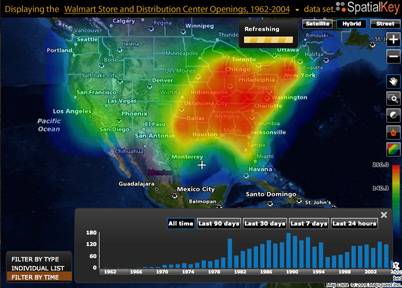
We are not talking about a few hundred of points on a map, you can see millions of those points. And not only that, but also you can view them as heatmaps, squares, aggregated points and more.
We've had the pleasure to work with an amazing team in what I think is the next generation of map visualizations.
We are not talking about a few hundred of points on a map, you can see millions of those points. And not only that, but also you can view them as heatmaps, squares, aggregated points and more.
Another key point is the filtering the data. Having too many points is great but without a tool to drill down to filter the data, you may encounter that is difficult to find what you are looking for.
In addition to that, you can compare data and visualize the differences between them, for example data from different periods (year, months, days, etc). Talking about time, there is a great timeline component that allows you to "play back" the data in time, displaying an animated sequence. It also has the ability to drill down and select specific time periods.
All these different types of visualizations together with the tools that manipulate them make the whole experience richer. You are giving back to the user the power to explore the data in a completely new way.
It amazes me how easy is to find new relations in the data or find new answers to your questions just by looking at and playing with those visualizations.
But this is just the tip of the iceberg, more is coming. I encourage you to take a look even if you are not a map or GIS guy and discover what is behind a simple map.
Kudos to the UM team.