Switcher mobile skin for a toggle button
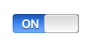
One of the components that is very common in a mobile app is the Switcher component. The on/off switch is usually available on IOS and Android devices. This component is like a toggle button but with a skin that makes it look as a Switcher.
One of the components that is very common in a mobile app is the Switcher component. The on/off switch is usually available on IOS and Android devices. This component is like a toggle button but with a skin that makes it look as a Switcher.
Application
This is just a simple test and we have all the styles hardcoded on it.
		@namespace s "library://ns.adobe.com/flex/spark";
		s|ToggleButton
		{
			skin-class: ClassReference("skins.SwitcherSkin");
			background: Embed(source='/images/switcher_bg.png');
			thumb: Embed(source='/images/switcher_thumb.png');
		}
I have a special skin, SwitcherSkin, for the toggle button that transforms the normal toggle to a switcher.
Skin
We are extending from MobileSkin to make our skin lightweight for a mobile project. And we only have 2 elements on it: the background that has the on/off background and the thumb that moves to cover the on/off labels.
package skins
{
	import caurina.transitions.Tweener;
	import flash.display.DisplayObject;
	import spark.skins.mobile.supportClasses.MobileSkin;
	public class SwitcherSkin extends MobileSkin
	{
		protected var background:DisplayObject;
		protected var thumb:DisplayObject;
		override protected function commitCurrentState():void
		{
			super.commitCurrentState();
			invalidateDisplayList();
		}
		override protected function createChildren():void
		{
			background = addElement( "background" );
			thumb = addElement( "thumb" );
		}
		protected function addElement( style:String ):DisplayObject
		{
			var elementAsset:Class = getStyle( style );
			var element:DisplayObject;
			if( elementAsset )
			{
				element = new elementAsset();
				addChild( element );
			}
			return element;
		}
		override protected function updateDisplayList(unscaledWidth:Number, unscaledHeight:Number):void
		{
			if( currentState == "up" )
			{
				Tweener.removeTweens( thumb );
				Tweener.addTween( thumb, { time:0.4, x:0 } );
			}
			if( currentState == "upAndSelected" )
			{
				Tweener.removeTweens( thumb );
				Tweener.addTween( thumb, { time:0.4, x:unscaledWidth - thumb.width } );
			}
		}
	}
}
To make it more interesting, I added a little tween using the Tweener library . I hope you like it. You can improve on it making the labels dynamic and the dimensions too.